In this composition we were split into group and began taking photos of each other, however they weren't traditional portraits, we had to have the rest of the group talking to and asking questions to the person being photographed so that they were showing different expressions and were caught in some strange poses. I like how they've turned out, and I think putting them together in the block of nine helps with their overall impact.
Monday, 26 September 2011
Richard Avedon
I like how these photos by Richard Avedon are almost controversial and so unexpected they shock the viewer, I'd like to try and create some photos that have a similar effect.
Irving Penn
I like looking at the work of Irving Penn as he often takes people you wouldn't expect to be photographed, and shows them in a way you would see as untraditional. I like how this makes you consider the way stereotypes are what you expect to see, and then when you see the reality of the image you are sometimes shocked at the outcome.
Bill Brandt
The work of Bill Brandt inspires me to look into finding contrasting tones much more as his work is all very opposing tones, with a deep black building against a white skyline, or a white reflective object against a dark backdrop.
Corinne Day - Fifteen collection
All the photos by Corinne Day inspire me to consider using black and white photography more than I do, as the effect of looking at these is quite emotion provoking, and I would like some of my photos to have a similar effect.
Monday, 19 September 2011
Chesterfield - Week Two. Exploring possibilities
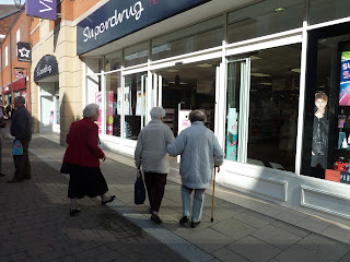
Progression of photographs throughout the town exploring juxta-positions and non-landmark possibilities.
I like how this sequence, although not obviously linked together, has connections from being out of place, to food. I really like the butcher van as it seems like such a strange thing to see in the middle of a town centre, yet it seems so normal at the same time.
I think the photo of the elderly woman in front of Primark could have been a better photo if I had managed to focus on her, instead of on the windows above the store, however as it was a hip shot I had little control of where I was focusing the camera.
Sunday, 18 September 2011
Student Services
Comparing this image to the other two I had taken I decided that this is the one I would rather present as i feel the angle of the image is much better than the other two, and the clear contrast between the grey and white makes quite a strong effect.
North Block 2
I chose this image out of the three that I have taken as I feel that the other two are, although being bright, not as interesting to look at. I feel that this photo, although not being focused in quite the right place, is quite intriguing to look at, however the image isn’t straight vertically so if I was to edit this image, this is the first alteration I would make. I quite like the way the light falls across the wall at an angle and slightly obscures the view.
Main Entrance
I decided to chose this image for the Main Entrance over the other two I ad taken as I didn’t feel they were as strong images, whereas I feel I focused this one better and like how the line of the building isn’t straight across the centre of the picture, but is at an angle about 2/3rds of the way up. I also really like the contrast between the bright blue sky and the yellow sign and white building.
The Dome
I chose this photo out of the three I took in the dome as I felt that this photo creates more of an impact than the other two as the contrasting colours of the red on the white, and the way you have diagonal lines from the corners leading into the centre. If I was to edit this image I would slightly adjust the angle of it, as the line of the wall isn’t quite straight.
Martin Parr
I love the obvious contrast in this photo of the expensive fur coats of the people in the image, and the coca cola bottle standing on their table in front of them.
Joel Meyerowitz - Fallen
I like how this image is showing exactly what happens in busy cities, someone falls down, everyone stares and no-one helps. I think it was quite a clever way that the photo has been captured with the crowd of people all off to one side, and a contrasting lightness of white cars and only one person on the opposite side.
William Eggleston - Animals
I like how different this image is, and how strong the contrast of the yellow duck is when placed onto a black desk.
Subscribe to:
Comments (Atom)


